Imagining Burberry without its iconic trench coat or signature beige check seems impossible; yet Daniel Lee’s high-stakes debut at Burberry did exactly that. On the 20th of February at London Fashion Week, the world got to see Lee’s first collection at Burberry as Chief Creative Director after taking over the reins from Ricardo Tisci in September last year. Founded in 1856 by Thomas Burberry, Burberry is most famous for introducing gabardine, a breathable, waterproof and hard wearing fabric that revolutionised rainwear. The brand has undergone different iterations, most recently being the streetwear and monogram-focused Burberry by Tisci. A change in creative directors usually means a brand wishes to change its direction so what went wrong with Tisci’s Burberry and what can we expect from Lee’s Burberry?
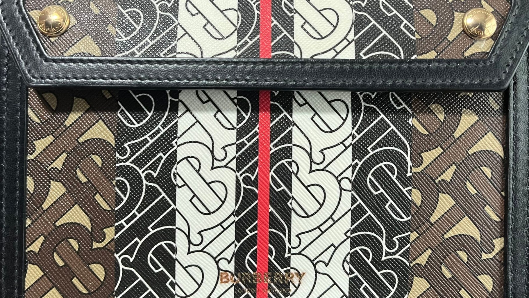
Tisci’s Burberry was not all bad. I quite liked the new monogram he introduced along with graphic designer Peter Saville that was a riff on Thomas Burberry’s initials in an interlocking pattern. This served Tisci’s streetwear focused brand direction well as we saw the pattern on countless hoodies, sneakers and bags. Giving Burberry a recognisable monogram seemed like a smart move but some have criticised the pattern for being tacky and lacking the heritage behind other iconic monograms.
Another criticism of Tisci’s Burberry is replacing Burberry’s long-standing logo with a boxy and uninspiring Helvetica one. In fact, nearly all major luxury brands left behind their elaborate logotypes for simple black letters without any embellishments. Even though Burberry’s logo ended up lost in a sea of homogeneity, Tisci did this for a reason. The change allowed for easy scalability and versatility on different media. While Tisci’s 5-year stint at Burberry was a mixed bag, the bottom line was the products were just not selling and the brand’s growth was stagnating.

Enter Lee, named “fashion’s new wonder boy” by Harper’s Bazaar and “The Quiet Radical” by Vogue. Most known for his work at Bottega Veneta as creative director from 2018 to 2022, Lee was able to reinvigorate the Italian heritage brand while keeping true to its logoless simplicity and craftsmanship driven branding. One of the most notable introductions to the brand was when he padded up the Intrecciato pattern, a braided technique synonymous with Bottega that involves intertwining strips of leather into a woven pattern. Despite a complicated technique, Lee showed that leather could be manipulated to be soft and fluffy instead of rigidly durable,
As the padded cassette bags skyrocketed in popularity, we can’t forget Lee’s creation of fashion’s “it” bag. I mean seriously this bag was all over Instagram and Tik Tok the past few years. I’m talking about none other than Jodie bag. From his time at Bottega, especially from the accessories category, Lee is a mastermind when it comes to bringing commercial appeal which Burberry hopes he can bring.
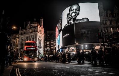
In preparation for London Fashion Week, Lee’s Burberry began with a complete overhaul of the brand’s identity and wiped all posts off the brand’s Instagram account. The new campaign was shot between iconic London landmarks such as Trafalgar Square and Albert Bridge, drawing upon the brand’s British heritage with a modern twist. Each picture contained a redesign of the equestrian knight logo carrying a flag with the words “Prorsum”( Latin for “Forward”). Alongside this campaign was a new typeface as we finally said goodbye to the boring Helvetica logo with a stretched and curved blocky sans-serif one.
For Lee’s debut collection, the runway was full of rose prints, all-over duck prints, oversized fur coats and having the house check magnified in electrifying colours. The collection presented a grungier, younger and more chaotic side to Britishness that was very Vivienne Westwoodesque. I can definitely see the commercial appeal as the collection has a good mix of wearable pieces as well as more experimental ones. I was most impressed by his use of bright colours that contrasted the usual beige and black muted tones that one associates with Burberry.
Did Lee meet the high expectations? So far reviews have been positive but only the sales numbers can attest to his success. Imagine his subsequent collections if he could redefine the brand in one collection! While I am a huge fan of Tisci’s Burberry (I even bought a bag with the TB monogram), Lee’s grungy and decadent Burberry has got me hook line and sinker.


