


It is okay to make mistakes when designing a poster for the first time. However, if you want to get good at this sacred form of communication that will skyrocket turnout for a refreshing talk on horrors on history/Pol/pulp fiction, DDLJ ..etcetera/ use-of-words-like-et-cetera, you should read through.
Blank poster:
Now that you have decided to make a poster, one would imagine the only problem is to design it in such a way that will attract attention without being shredded to pieces. Best way out of this is to make a blank poster. They will try to guess what it means; everyone will have their own ideas. Suddenly you have the entire campus thinking about the ‘blank poster’. People will come up with different ideas about it and will dream up parallel timelines involving the mysterious poster to add to discourse. Before you know it, the blank poster has become a world of its own. It has its own laws, currency, tastes.
Person A: Maybe it’s just a blank poster.
Person everyone else : Bro like…. what if everything is blank…you know…and and maybe the poster is an image of this world…(continued with more ‘you know’ and ‘like’ and ‘maybe’ and ‘seriously’ and ‘and’)
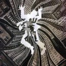
Make a poster inside a poster :
You think a simple poster with all the details is good enough? Is that your master plan?
Dekh beta, anything meta is good shit. Everyone digs it. Take this piece. This article is talking about meta. Its meta-meta. Wait. Now, it’s meta-meta-meta. Now it’s meta-meta-meta-meta. Now….
The only poster better that a poster inside a poster, is a poster inside a poster inside a poster.
What’s better than that you ask? Take a minute. Think. You got this.
Paste it well : Pasting posters at the right place is also very important. Common mistake : pasting it in the lift. No one uses the lift . Residents of first three floors use the stairs. Positively. Residents of the fourth and fifth floors are busy pressing the button that shuts the door on the lift, thinking it keeps the lift from opening at first three floors. People on other floors are so high, having given up their hopes of reaching ground floor without a million halts, they’d rather nap than look at the poster.
Pro tip : Post it in the common room during blood-donation camp. Everyone shows up for that, like like, seriously everryoneee , you know.
Make the poster useful :
What you could do is paste the hunger cycle QR code at the centre of the poster. The poster gets all the attention and Johnny boy gets to order his bacon pasta. Don’t you just love it when in a talk about wildlife preservation you have old John in the front row ripping through his bacon. Oh my my!
Pay attention to the details
Make the poster as detailed as possible. By details, I mean food. If there is going to be some snack, make sure you mention it.
Tea? Yes sir.
Coffee? Cool, at least some people will stay awake throughout the event.
Lemon water instead of coffee? Chalega.
Make it look like a beverage-and-biscuit session. Skip the unnecessary details. I don’t need to know that there is a guest lecture about Stalin. However, the fact that sandwiches are going to be served before the lecture is a crucial detail that you must capitalize on. Coleslaw 1 – Stalin 0
Make it reusable :
Even if the poster is torn within 5 milliseconds, your efforts won’t go waste. We are always running out of toilet paper. I’m just saying.
Let it decide :
Who are you to decide what the design should be? Let the poster decide, even if you know very well that it cannot make sound decisions. Let it make mistakes, nurture its fragility. Make it responsible, let it travel to new places. Who knows what it might want to be; it might just decide against being a generic poster about some musical concert. Who knows, maybe it wants to be about a plantation drive. Scope or no scope, let it breathe.
Don’t
We must understand that when it comes to dealing with public, the right thing to do is to give them what they want. If you understand this, you will realize that there should be no poster at all.
Drop the idea. Get it out of your mind. Do some yoga. Have green tea.
If there is no poster, well, no one can tear it. Aha! that’ll show them.
Edited by Gauri Jhangiani
All images are curated by Viraj Malani
A